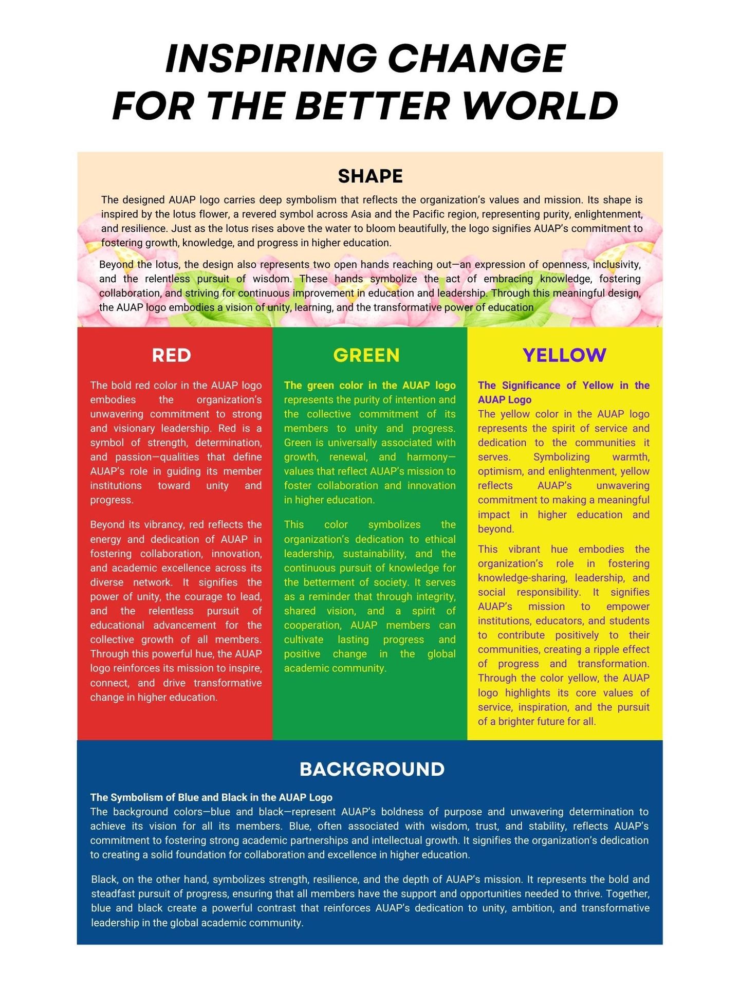
SHAPE
The designed AUAP logo carries deep symbolism that reflects the organization’s values and mission. Its shape is inspired by the lotus flower, a revered symbol across Asia and the Pacific region, representing purity, enlightenment, and resilience. Just as the lotus rises above the water to bloom beautifully, the logo signifies AUAP’s commitment to fostering growth, knowledge, and progress in higher education.
Beyond the lotus, the design also represents two open hands reaching out—an expression of openness, inclusivity, and the relentless pursuit of wisdom. These hands symbolize the act of embracing knowledge, fostering collaboration, and striving for continuous improvement in education and leadership. Through this meaningful design, the AUAP logo embodies a vision of unity, learning, and the transformative power of education.
RED
The bold red color in the AUAP logo embodies the organization’s unwavering commitment to strong and visionary leadership. Red is a symbol of strength, determination, and passion—qualities that define AUAP’s role in guiding its member institutions toward unity and progress.
Beyond its vibrancy, red reflects the energy and dedication of AUAP in fostering collaboration, innovation, and academic excellence across its diverse network. It signifies the power of unity, the courage to lead, and the relentless pursuit of educational advancement for the collective growth of all members. Through this powerful hue, the AUAP logo reinforces its mission to inspire, connect, and drive transformative change in higher education.
GREEN
The green color in the AUAP logo represents the purity of intention and the collective commitment of its members to unity and progress. Green is universally associated with growth, renewal, and harmony—values that reflect AUAP’s mission to foster collaboration and innovation in higher education.
This color symbolizes the organization’s dedication to ethical leadership, sustainability, and the continuous pursuit of knowledge for the betterment of society. It serves as a reminder that through integrity, shared vision, and a spirit of cooperation, AUAP members can cultivate lasting progress and positive change in the global academic community.
YELLOW
The Significance of Yellow in the AUAP Logo
The yellow color in the AUAP logo represents the spirit of service and dedication to the communities it serves. Symbolizing warmth, optimism, and enlightenment, yellow reflects AUAP’s unwavering commitment to making a meaningful impact in higher education and beyond.
This vibrant hue embodies the organization’s role in fostering knowledge-sharing, leadership, and social responsibility. It signifies AUAP’s mission to empower institutions, educators, and students to contribute positively to their communities, creating a ripple effect of progress and transformation. Through the color yellow, the AUAP logo highlights its core values of service, inspiration, and the pursuit of a brighter future for all.
BACKGROUND
The Symbolism of Blue and Black in the AUAP Logo
The background colors—blue and black—represent AUAP’s boldness of purpose and unwavering determination to achieve its vision for all its members. Blue, often associated with wisdom, trust, and stability, reflects AUAP’s commitment to fostering strong academic partnerships and intellectual growth. It signifies the organization’s dedication to creating a solid foundation for collaboration and excellence in higher education.
Black, on the other hand, symbolizes strength, resilience, and the depth of AUAP’s mission. It represents the bold and steadfast pursuit of progress, ensuring that all members have the support and opportunities needed to thrive. Together, blue and black create a powerful contrast that reinforces AUAP’s dedication to unity, ambition, and transformative leadership in the global academic community.